Table of Contents
Your team just spent three months building a new onboarding flow. The design looks great in Figma. The developers shipped it on time. But two weeks post-launch, your activation rate has barely moved, and you're not sure why.
This is what happens when teams design for the product they've built, not the experience their users are actually having. A user journey map fixes that by putting the user's perspective at the centre of every decision.
In this guide, we'll break down exactly what a user journey map is, how it differs from a customer journey map, what goes inside one, and how to build one that actually drives decisions, not just decorates a wall.
What Is a User Journey Map?
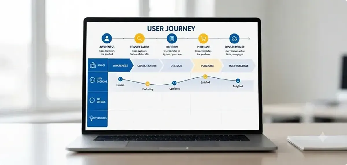
A user journey map is a visual representation of the steps a user takes to accomplish a specific goal with your product or service. It documents their actions, thoughts, and emotions at each stage, revealing where the experience feels smooth and where it breaks down.
Think of a user journey map as a GPS for your product. It shows where users are trying to go, where they're getting lost, and what you need to fix to help them reach their destination.
Unlike a sitemap or a flowchart, which show what the product does, a user journey map shows what the person experiences. It captures the confusion that arises when something isn't clear, the frustration that follows when a step fails, and the delight that comes with things just working. According to Nielsen Norman Group, journey maps are most valuable when grounded in real user research rather than internal assumptions.
User journey maps help teams:
- Align around a shared understanding of the user experience
- Identify pain points before they become product-breaking problems
- Prioritise features based on real user moments, not guesses
- Design with empathy instead of assumptions
If you're new to UX research, our guide on UX design examples gives a solid foundation for how research informs great design.
User Journey Map vs. Customer Journey Map
These two terms are often used interchangeably; however, they serve distinct purposes. Here's a clear breakdown:
| Dimension | User Journey Map | Customer Journey Map |
|---|---|---|
| Focus | Interactions with your product/service | Full brand relationship end-to-end |
| Scope | Narrow, specific task or feature | Wide awareness through loyalty |
| Used by | UX designers, product teams | Marketing, sales, CX teams |
| Goal | Improve usability and product flow | Drive revenue and brand loyalty |
| Data source | Usability tests, user interviews | Analytics, CRM data, surveys |
In short, a user journey map zooms in on product interactions, while a customer journey map zooms out to the full brand relationship. For B2B product and UX teams, the user journey map is usually the more immediately actionable tool.

Why User Journey Mapping Matters
Done well, a user journey map is one of the most powerful tools in a product team's arsenal. Here's what it actually delivers:
1. It uncovers invisible friction
Users rarely tell you where they struggle; they just leave. Journey mapping forces you to walk in their shoes at every step, making it possible to spot friction that analytics alone can't explain.
2. It creates team alignment
When designers, developers, and product managers all look at the same journey map, they stop debating opinions and start solving for the same user moments. It replaces internal arguments with shared empathy.
3. It turns data into stories
Metrics tell you what happened. Journey maps tell you why. By pairing analytics with qualitative research, you get a complete picture that drives smarter decisions.
4. It prioritises what actually matters
Not every feature request is worth building. A journey map shows which pain points have the highest impact on user success, helping teams say no to the wrong things and yes to the right ones.
5. It reduces churn risk
Friction in the early stages of a journey onboarding, first use, first value moment- is the number one cause of early churn. Mapping these stages lets you proactively address issues before users walk away. This connects directly to the principles we cover in our guide on AI tools for UX design, where automation can help teams surface friction faster.
The 7 Key Components of a User Journey Map
Every user journey map is different, but the best ones share a common set of building blogcks:

1. User Persona
Every journey starts with a real person. Your persona should be grounded in research, not a wishful composite. Include their role, goals, technical comfort level, and key frustrations. A single, well-defined persona keeps the map focused and honest. Learn how to approach this in our article on UX vs UI design.
2. Scenario and Goal
What situation is the user in? What are they trying to achieve? For example: "A first-time user signs up for a SaaS tool and wants to complete their first project within the trial period." The scenario sets the context; the goal defines success.
3. Journey Phases / Stages
Break the journey into meaningful stages. Common frameworks include:
- Awareness → Consideration → Decision → Onboarding → Regular Use → Advocacy
- For SaaS: Sign-up → First Login → First Value → Habit Formation → Expansion
Choose stages that reflect how your specific user actually moves, not a textbook template.
4. User Actions
At each stage, what is the user actually doing? Clicking a link, filling a form, watching a tutorial, emailing support? Document the specific actions. This is what your product team can directly respond to.
5. Touchpoints and Channels
Where is the interaction happening? Website, mobile app, email, Slack notification, in-app tooltip, customer support call? Mapping touchpoints reveals gaps, moments where users need help but aren't getting it.
6. Emotions and Mindset
This is what separates a journey map from a process diagram. Capture how the user feels at each stage: curious, confused, frustrated, delighted? Use quotes from real user interviews wherever possible. Plot an emotional curve (high to low) across the journey to visualise the experience arc.
7. Pain Points and Opportunities
For every stage, document what's going wrong (pain points) and what could make it better (opportunities). This is where the map becomes a product strategy tool, turning observations into actions.
Types of User Journey Maps
Not all journey maps serve the same purpose. Here are the four most common types:
Current-State Map
Documents the user experience as it exists today, warts and all. This is the most common starting point for design projects. It's your honest baseline.
Future-State Map
Shows the ideal experience you're designing toward. Built after identifying pain points in the current state, it aligns teams on what 'good' looks like.
Day-in-the-Life Map
Zooms out beyond your product to show the full context of a user's day. Especially useful for B2B tools, where your product is one of many competing for attention during a workday.
Service Blueprint
The most detailed version maps the user journey alongside the behind-the-scenes processes that power each stage. According to the Interaction Design Foundation, service blueprints are ideal when redesigning service delivery holistically, not just the interface.

How to Create a User Journey Map: Step-by-Step
Here's a practical process you can run with any team from early-stage startups to established product companies.
Step 1: Define your scope and persona
Start narrow. Pick one persona and one specific goal. A journey map that tries to cover everything covers nothing. For example: "Priya, a B2B SaaS product manager, is trying to export her first report from the analytics dashboard."
Step 2: Gather your research
Journey maps are only as good as the data behind them. Collect:
- User interview recordings or transcripts
- Session recordings (Hotjar, FullStory, etc.)
- Support tickets and common complaints
- Analytics data drop-off points, time-on-task, and error rates
- NPS or CSAT feedback
If you don't have all of this, even 5 user interviews will reveal more than most teams expect.
Step 3: Define your journey stages
Based on your research, map out the stages your user goes through. Aim for 4 - 7 stages. Too many and the map becomes unreadable; too few and you lose nuance.
Step 4: Fill in actions, touchpoints, and emotions
For each stage, document: what the user does, where they do it, and how they feel. Use direct quotes from research wherever possible; they make the map feel real, not theoretical.
Step 5: Plot the emotional curve
Add a simple line graph across the map showing emotional highs and lows across the journey. This single visual is often the most impactful part it immediately shows leadership where the experience is broken.
Step 6: Identify pain points and opportunities
For each stage, add a row for what's going wrong and a row for what could be improved. Be specific 'user is confused' is not a pain point. 'User cannot find the export button because it's buried in a submenu' is.
Step 7: Share it, don't shelf it
Run a workshop with your team. Walk through the map together. Assign ownership of opportunities. Set a date to review progress. A journey map that sits in a Google Drive folder helps nobody. This aligns with the broader principles in our guide on design systems in UI UX.

Need a UX audit before you start mapping? Anarish runs structured UX audits for B2B product teams to identify the biggest drop-off points before you build. → anarish.com/contact
Real-World Example: SaaS Onboarding Journey Map
Here's a simplified example for a B2B SaaS product with a free trial model. This is the kind of map Anarish builds during discovery projects with product clients.
Persona: Rohan, a 32-year-old product manager at a mid-size tech company in Bengaluru. He's evaluating project management tools and needs his team to live within 14 days of trial start.
Scenario: Rohan signs up for a free trial and tries to set up his first project board and invite his team.
- Stage 1 - Sign-up: Rohan finds the landing page via Google. Emotion: Curious, cautious. Pain point: The sign-up form asks for a credit card upfront friction and trust concerns.
- Stage 2 - First Login: A blank dashboard with a generic 'Welcome' message. No onboarding checklist. Emotion: Uncertain. Pain point: No guidance on what to do first.
- Stage 3 - First Project Setup: Rohan can't customize columns and opens the Help docs. Emotion: Frustrated. Opportunity: An in-product tooltip here could cut support volume significantly.
- Stage 4 - Team Invite: Two out of three invitations land in spam. Emotion: Annoyed. Pain point: No shareable invite link as a fallback.
- Stage 5 - First Value Moment: After 40 minutes, the team has their first board running. Emotion: Relieved, satisfied. Opportunity: A congratulations message + targeted upsell nudge here drives trial-to-paid conversion.
This map surfaces four distinct product problems, all with a direct impact on trial-to-paid conversion. That's the power of journey mapping done right.

Common Mistakes to Avoid
Building it without real user data
The most dangerous journey map is the one built entirely from internal assumptions. Without research, you're documenting what you hope your users experience, not what they actually do.
Making it too broad
A journey map covering every user type across every possible flow is too complex to act on. Start with your most important persona and your most critical flow.
Creating it in isolation
If the map is built by one designer and emailed to a team, it won't create alignment. Journey mapping works best as a collaborative exercise involving engineering, product, customer success, and leadership.
Forgetting the emotional layer
A journey map without emotions is just a flowchart. The emotional arc is what creates empathy, and empathy is what makes teams actually care about fixing the problems they find. This principle also applies to card sorting in UX, where user emotions shape how information should be organised.
Not updating it
Products evolve. So do user behaviours. A journey map from 18 months ago may be completely outdated. Treat it as a living document and revisit it after major product changes or new research rounds.
Best Tools for User Journey Mapping
| Tool | Best For | Pricing |
|---|---|---|
| FigJam | Real-time collaborative mapping | Free / Figma plan |
| Miro | Workshops and team alignment | Free / from $8/user/mo |
| UXPressia | Dedicated journey map software | From $20/mo |
| Lucidchart | Clean diagrams with integrations | From $7.95/mo |
| Notion + Miro | Lean startups, early-stage teams | Free to start |
For most B2B product and UX teams, FigJam or Miro is the right starting point; they're built for collaboration, require no learning curve, and are easy to share with stakeholders. If you're already using Figma for design, FigJam is the natural choice. See how AI is changing tool selection in our post on AI tools for UX design.

Final Thoughts
A user journey map is not a deliverable you hand over and forget. It's a shared language, one that helps your entire team see the product from the user's perspective and make decisions that actually reflect their experience.
The best products aren't built by teams who know the most about technology. They're built by teams who know the most about their users. Journey mapping is how you get there.
If you're working on a product and don't know where to start, pick your most important user, pick their most critical task, and start mapping. You'll find more actionable insights in an afternoon than most teams find in a quarter of analytics reviews. To go deeper on UX research methodology, check out our post on UX writing and how language shapes the user journey at every stage.
Read Next: UX Research Methods: The Complete 2026 Guide
.png&w=640&q=75)