Table of Contents
Most teams treat accessibility as a developer’s post-launch job. WCAG 2.2 suggests otherwise. Its six new AA criteria cover focus visibility, target size, dragging, help placement, redundant entry, and login, and they’re decided at the design stage. This guide breaks down what changed and what to fix first.
The WCAG 2.2 tells us what a keyboard user can genuinely see when they click it, when a login form restrains one to an unintended memory test, when a support chat-button remains where a screen-magnifier user suspects to find it. Accessibility is mostly viewed by most teams as a developer task, a problem for postlaunch solutions.
Ultimately, most of the latest requirements in WCAG 2.2 are already wireframing decisions months and months before developers get involved. This news guide will take you through what actually shifted from WCAG 2.1 to 2.2, which of the new success criteria are most important for your UI/UX team to focus on, and where the next legal shifts are headed.
What Changed Between WCAG 2.1 and WCAG 2.2
Imagine a design critique at a UI/UX shop in 2026. Someone fires up a checkout flow on their laptop, uses only their arrow keys to navigate around, and sees the focus outline vanish behind a sticky promo banner halfway down the page. Nobody made a change to a single line of code for that to happen.
It was a layout decision made weeks ago, and it's precisely the sort of space WCAG 2.2 was created to bridge. The Web Content Accessibility Guidelines, called WCAG for short, are the global standard for designing digital products that the disabled population can actually interact with.
The 2.2 iteration was issued by the W3C on 5 October 2023 and is nested within the larger WCAG 2 standard, which caps all touchpoints within four overarching goals (content must be seen, operated, understood, and built to last for assistive tech). So at Anarish, a B2B UI/UX design agency, this gets reviewed at the wireframe stage, by the designer, not left for a developer to find after launch. It looks like nothing from WCAG 2.1 disappears with WCAG 2.
WCAG 2.2 is a superset of 2.1 – it keeps all the rules from 2.1, removes one rule about code processing that today's browsers rendered unnecessary, and adds 9 up-to-date success criteria. Since 2.2 is a superset of 2.1, there is no disadvantage in designing against that version now rather than waiting for a client or law to more exactly demand it. The six of those nine that are at Level AA are the most common they're set to an organizations design and audit level. These 6 appear regularly in the day to day product work that is why they're worth outlining each individually.
Where Keyboard Users Lose the Plot
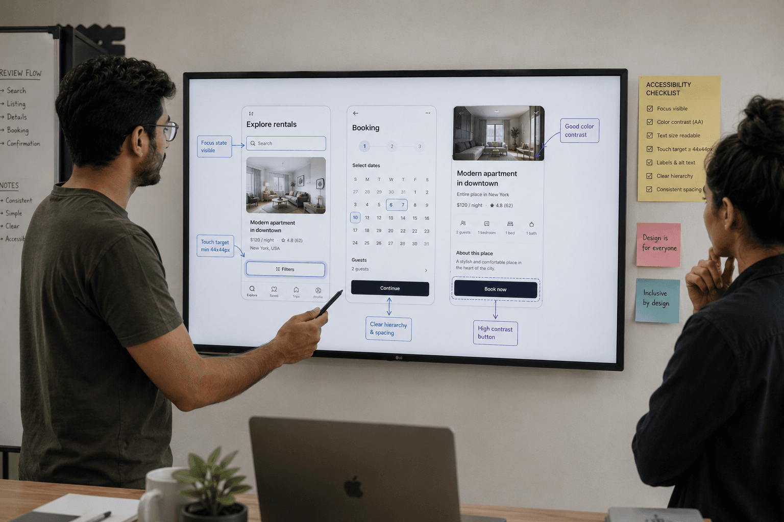
Two of the new delusions are concerned with what happens when you get off your mouse: the first is where a concentrated piece of content gets obscured by a fixed element on the page like a sticky header, a persistent footer bar, or an overlay with no close box. If someone has tabbed to a link and can't see it because a banner has obscured it, this is the problem.
If a popup the user opens and can close themselves, that doesn't count, since the user has control. The solution is implemented during the initial page layout: designers who include sticky elements need to leave enough scroll room so that a focus will never land underneath the one.
The second is dragging. Sliders, re-orderable lists, draggable map pins? All of these depend on the small movements of fine motor skills; people don't have that skill at all, maybe because of ability, maybe because our laptop trackpad won't respond to a hard click anymore. Every drag-based interaction needs to be replaced with a single tap or arrow key if they're to be accessible, with planning built-in from the get-go and not afterwards as a cost of usability.

Where Interfaces Get Too Small or Ask for Too Much
A third makes sure clickable things don't get too tiny: 24×24 CSS pixels, except when there is sufficient whitespace around a smaller element so an invisible 24-pixel circle centered on it wouldn't hit another target. This generally prevents the kind of congested interface where two things are close enough that you accidentally tap the wrong one, something that happens all the time in filter chips, pagination controls, and row actions in tables. A similar but distinct requirement is that help links, a support chat bubble, contact links, and an FAQ shortcut should each be located in the same relative position on every page.
If a user is using a screen magnifier or having everything in a memory-dependent navigation system, forming an internal image of where everything is, a support link that bounces from corner to footer on each page breaks that imaging process every time it moves. The other two modifications deal with the login and create an account, two of the most abandoned flows on any site. The first says that a person shouldn't have to type in something they already entered earlier in the session, except for re-verification of something sensitive such as a password for a security-related change.
A defaulted billing-address checkbox that copies the shipping address, combined with default autocomplete attributes on the form fields, accomplishes most of this automatically. The second dispenses with memory and doing a puzzle as a login requirement. A run-of-the-mill password box is still okay, as long as pasting is effective and the password manager is able to fill it in; the somewhat-the-of-remembering-a-password is concentrated into the manager's mind, not the user's.
What doesn't work is asking someone to copy-paste a distorted string of goobledeegook by hand. A CAPTCHA based on picture recognition rather than transcribing warped text generally passes muster, because recognizing a certain image isn't considered the same sort of mental task.

Beyond the Code: Video and Media Content
Really, WCAG 2.2 works just as well after static pages is common sense, but video is the most common medium teams believe themselves to be covered already. Uploading a simple subtitle file seems sufficient, but implementation alone typically is not, and the common failures are easy to predict with a little advance planning:
Caption text can be too minute to read, or too similar in colour to the footage behind it; there is no sound description for a visual moment which a blind viewer would otherwise completely miss. There is no predefined transcript for anything visually complex which a screen reader could work through. No pre-warning was given about any flashing or strobing material that might induce a seizure. Tags are missing for a foreign language reader to interpret.
Any explainer video, product demo, or onboarding walk-through on a site should have them incorporated into the content plan from day one (like copy and imagery), not tacked on the week before launch.
Where the Law Is Heading
Although WCAG is a technical standard and not law, it's the standard on which most all accessibility law ultimately draws reference.
- In the United States, case law related to the ADA is leaning toward using WCAG AA as the achievable standard, and federal regulations for public-sector websites already use WCAG 2.1 AA as a standard.
- While for the European Union, the technical standard corresponding to the European Accessibility Act, EN 301 549, still makes reference to WCAG 2.1 AA today, the next update of it, expected in 2026, is to switch to WCAG 2.2 AA.
- In Canada, the Accessibility for Ontarians with Disabilities Act also builds on WCAG.
All of these are heading the same way. Going ahead with 2.2 AA design now saves us a second audit down the road once each law finally gets to where the standard already is.
Where This Fits Into a Design System
None of this calls for dismantling an existing product, though: target sizing, help placement, and redundant entry are the sort of fixes that live at the component level where changing the button spacing once within a documented design system fixes it on every screen that depends on that component. When it comes to focus visibility and alternatives for dragging, a look at interaction patterns (rather than the entire page inventory) is most often what is needed.
Knowing which domain owns which fix can also be useful. Target size and focus visibility are fundamentally visual and interaction choices, UI's responsibility, while consistent placement of help and RADI used as redundant entry are more analogous to how a user progresses through a flow, UX's responsibility. This UI vs. UX distinction is worth returning to if your team is still dividing up the work by job titles instead of by what each criterion really asks of you.
Final Thoughts
While on paper the difference between WCAG 2.1 and 2.2 isn't that dramatic - nine new things, and one page refresh removed - the reality is that each of the six AA-level changes equates to a real moment where a real user gets stuck: a focus ring suddenly drops, a button is just too small to hit reliably, a login suddenly demands a test of memory. To fix these gaps at the design stage is a review meeting. At the production date: a rebuild. If a product or web app would benefit from an accessibility-first UX review, get in touch with Anarish to discuss how well the intended design matches WCAG 2.2.