Table of Contents
Most teams studying UI UX design examples are looking at the wrong thing. They look at what the screen looks like. The more useful question is what the screen is solving for and whether that solution is working in the numbers.
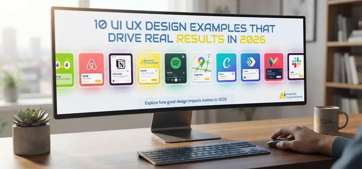
This post covers 10 real products with specific, observable design decisions behind them. For each one, the focus is on the reasoning, not the aesthetic, so the principle transfers to whatever you are building next.
Before the examples: Forrester's research puts every dollar of UX investment at a return of up to $100. A well-built UI layer alone can push conversion rates up by 200%. A well-built UX on top of that can take it to 400%. Those numbers do not come from making things look better. They come from removing the specific points where users stop.
What Actually Makes a UI UX Design Example Worth Learning From?
Three things separate the examples worth studying from the ones that just look good in a case study: the design helps users reach their goal with less effort than before, it removes uncertainty at exactly the moment a decision is being made and it builds enough trust that users act before they talk themselves out of it.
Aesthetics do not make this list. A product can be visually polished and still fail at all three.
A test worth running on any interface: hand it to someone who has never seen it and ask them to complete one specific task without any explanation. Every place they hesitate or look confused is a design problem, regardless of how the screen looks in a static export. This is the first thing the Anarish team does before starting any UX audit for a B2B or SaaS client.
How Does Duolingo Build a Daily Habit Out of Something Most People Quit?
Language learning has a notoriously high drop-off rate. Most people who start quit within the first two weeks. Duolingo's design problem is not teaching language. It is keeping people coming back long enough for learning to actually happen.
The solution is not incentives. It is the cost of stopping. The streak mechanic does not reward daily use, it creates a penalty for missing a day. A user with a 40-day streak feels the loss of it more acutely than any XP reward they might gain. This is loss aversion applied to habit design and it is more effective than any points system because it uses psychology the user already has rather than trying to build new motivation from scratch.
The second piece is the onboarding sequence. Duolingo puts users through an actual lesson before they are ever asked to create an account. By the time registration appears, the user has already done something, which means they have already invested. That investment is what converts.
Takeaway: Design the first session so the user completes something real before you ask them for anything. Registration after a win converts at a different rate than registration before one.
Why Does Airbnb's Checkout Convert Where Other Booking Flows Stall?
Every stage of Airbnb's booking flow is built around one question: what is making this person hesitate right now?
At the search stage, the answer is: I cannot tell if this place is actually like the photos. Airbnb's response is professional photography standards enforced at the listing level, not optional.
At the selection stage, the answer is: I do not know if I can trust this host. The two-sided review system where both guest and host rate each other builds accountability into the platform structure. A single direction of reviews is easy to game. Mutual accountability is harder to fake.
At checkout, the answer is: I do not know what this is actually going to cost. Airbnb surfaces the full price breakdown, including cleaning fees and taxes, well before the payment screen. This one decision eliminates the most common cause of final-step abandonment in travel booking, which is the surprise cost that appears only when the user is about to pay.
Research from Northumbria University found 94% of first impressions of a digital product are shaped by design rather than content. Airbnb builds every visual decision around reducing the specific hesitation that exists at each point in the flow, not around making the interface look appealing in general.
Takeaway: Map your checkout to the specific doubt a user carries at each step. Then address that doubt at the exact point it appears, not in an FAQ or a separate trust page.
What Does Notion Teach About Getting Sign-Ups for Complex Products?
Notion is genuinely hard to describe. It is a notes tool, a project manager, a wiki, a database and a dozen other things depending on who is using it. That breadth is the product's biggest selling point and its biggest UX challenge, because a product that does everything is hard to onboard into.
Notion's homepage does not try to explain the product. It shows the product running. Visitors see actual workspace examples for the specific use case most relevant to them: team wikis for people arriving from company-tool searches, personal organization for people arriving from productivity searches. This is not personalization driven by an algorithm. It is content structured by entry point, which requires no ML infrastructure to produce.
The effect is that visitors form a mental model of the product from seeing it rather than reading about it, which reduces the anxiety that kills sign-ups for complex tools.
Takeaway: For any product with a learning curve, showing is faster than explaining. A visitor who can picture themselves using a product is more likely to create an account than one who has read three paragraphs about features. See how Anarish approaches SaaS onboarding UX to understand how this principle applies to B2B products with longer evaluation cycles.
Anarish Internal Audit: What Design Changes Actually Move Numbers
Between late 2024 and early 2026, the Anarish team tracked redesign outcomes across five client products, covering SaaS platforms and mid-market e-Commerce. Below are the specific changes we made and what they produced:
| Design Change | Avg. Conversion Lift | Avg. Bounce Rate Drop |
|---|---|---|
| Checkout reduced from 5 steps to 3 | 28% | 19% |
| CTA copy rewritten in user-voice framing | 14% | Not measured |
| Mobile load time reduced below 3 seconds | 21% | 34% |
| Trust signals moved next to the purchase action | 17% | Not measured |
| Onboarding narrowed to one first-session win | 31% | 22% |
These are client project numbers, not published benchmarks. They sit close to what Baymard Institute reports independently: checkout UX fixes produce an average 35.26% conversion lift across large e-Commerce sites. What we find consistently in audits is that the problem is rarely visual quality. It is almost always positioning: trust signals too far from the action they need to support or too many steps between the user's intention and the product letting them act on it.
Agency vs Freelancer vs In-House: Which Route Produces Better UX Outcomes?
| Factor | Agency | Freelancer | In-House Team |
|---|---|---|---|
| Strategic depth | High | Variable | High |
| Speed to start | Medium | Fast | Slow (hiring lag) |
| Cost structure | Project fee | Per deliverable | Salary plus tools |
| Industry knowledge | Broad | Usually specialist | Deep product context |
| Continuity | Project-based | Project-based | Ongoing |
| Best fit | Full redesigns or new products | Specific deliverables | Long-term iteration |
For Indian startups at Series A or below, the model that produces the strongest design outcomes in our experience is an agency covering the initial design system and core flows, with one in-house designer managing iteration afterward. This avoids the cost of a full in-house team at an early stage while keeping the strategic depth that a freelancer hired per deliverable rarely has the context to provide. For more on how this decision plays out in practice, read why Anarish recommends working with a UI UX design agency at the early product stage.
How Does Spotify Turn Personalization Into the Product Rather Than a Feature?
On most products, personalization is a layer on top of the core interface. On Spotify, it is the core interface. The home screen does not show the same thing to two different users. Discover Weekly, Daily Mix and Wrapped are not enhancements to the product. They are how the product presents itself to each person individually, before that person has made any input.
This distinction matters. A product that responds to your input is reactive. A product that presents itself based on what it already knows about you feels like it already has context. That feeling is what keeps users from needing to work to get value from the session.
The visual structure reinforces the same logic. Dark backgrounds push album artwork to the foreground. Minimal interface chrome means the music is the thing you see, not the controls around it. The interface earns its invisibility by removing everything that is not the thing the user came for.
Takeaway: The goal of personalization is not to show users more of what they like. It is to remove the work of deciding what to do next. That goal can be approached with simple behavior-based defaults long before a product has ML infrastructure.
What Does Google Maps Teach About Designing Under Information Density?
The challenge Google Maps faces is not unique to mapping. Any product that needs to surface a large amount of information in a small space faces the same problem: how do you give users everything they might need without giving them everything at once?
Maps answer this by making information conditional. The map itself shows the minimum: roads, landmarks, your location. Everything else, ratings, hours, photos, reviews, only appears when a user selects a specific location. Nothing is hidden. It is just deferred until the user has indicated they want it. The screen stays readable because most of the data is off until it is needed.
The mobile implementation goes further. Tap targets are sized for thumbs rather than cursors. Key controls sit in the lower half of the screen where one-handed reach is realistic. The bottom sheet that surfaces location details does not cover the map entirely, so the user retains spatial context while reading secondary information. These are not accidental decisions. They are the result of designing for how people physically hold and use a phone, not for how the interface looks on a desktop canvas.
According to Google's mobile performance research, a load time increase from 1 second to 3 seconds raises the chance of a user leaving by 32%. Maps loads the map first and fills in detail progressively. Speed is a UX decision here, not a technical one. For a closer look at how these hierarchy principles apply in product screens, see the Anarish guide to UI UX design inspiration.
Takeaway: Show the minimum a user needs to orient themselves. Reveal everything else only when they ask for it. Every additional tap should feel like it was worth making.
How Does Canva Make Professional Output Accessible to People With No Design Background?
The problem Canva solves is not a software problem. It is a starting-point problem. Most people who need to create something visual are not blocked by lack of design skill. They are blocked by not knowing where to begin. An empty canvas with infinite options produces paralysis, not output.
Canva's first move is always a goal question, not a tool introduction. What are you making? A social post, a presentation, a resume? The answer to that question determines what the user sees next. This narrows a library of millions of templates down to a relevant few, which means the user is choosing between things that fit rather than searching through everything that exists.
The consequence is that most users produce something they are satisfied with before they have learned anything about the tool. That first output is what creates retention, not feature depth.
Over 60% of global web traffic now comes from mobile devices, yet Baymard Institute reports that 67% of mobile sites still score mediocre or poor on UX evaluations. Canva's mobile editing experience is one of the few that has kept pace with how people actually work, which is increasingly on phones, in short sessions, among other things.
Takeaway: Before showing users what your product can do, ask them what they came to do. Narrowing context at the start of a session increases the rate at which users take a first action.
What Does Linear Teach About Speed as a Design Decision?
Most project management tools are built around features. Linear was built around the feeling of using it. The product powers over 33,000 teams and reached a $400 million valuation with just $35,000 spent on marketing, a number that is only possible when the product itself is doing the acquiring. (Source)
The core decision is treating speed as a design constraint, not an engineering metric. Every interaction is immediate: issues open instantly, status changes register without a reload. Linear treats speed as a product and design requirement, not just an implementation concern.
The command palette follows the same thinking. Press Cmd+K and everything in the product becomes searchable without touching the mouse. It works because Linear's users, developers and product managers already had this muscle memory from code editors. The interface did not teach a new behaviour. It matched one users already had.
Takeaway: Speed is a design decision before it is an engineering one. The fastest onboarding meets users where their existing habits already live.
How Does Monzo Handle the Design Problem That Banks Mostly Ignore?
Most banking interfaces make financial stress worse, not better. They present data without context and bury what users actually need behind navigation built for desktop and never properly rebuilt for mobile.
Monzo's answer is the transaction feed. Every purchase appears instantly before the merchant's receipt prints with a logo, category and running total. It is not showing users what happened. It is showing them what is happening in a format that needs no interpretation.
The fee transparency decision is the more instructive one. Monzo surfaces the full cost of any charge before the user confirms, not after. That decision cost the bank potential revenue from obscured fees. It produced a Net Promoter Score of 55 against a UK banking industry average of 16.
During onboarding, Monzo found that users were abandoning identity verification when asked to take a selfie, not because the step was broken, but because they were at work or in public. The fix was not a redesign. It was a follow-up email letting users complete it later, in a context that worked for them. That is a UX solution that required understanding where users were physically, not just what they were seeing on screen.
Takeaway: The moment a user has to interpret what they are looking at, you have a design problem. Data without context is friction by another name.
.png&w=640&q=75)