Table of Contents
Introduction
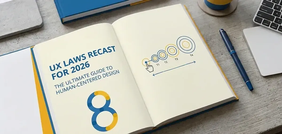
Building great digital experiences isn't just about what looks good, but also about what feels good. And while our tools and platforms evolve quickly, human behavior does not. And so the traditional UX laws remain as relevant today as they were when they were originally designed.
From spatial computing and AI interfaces to voice interfaces and neuroadaptive UIs, the user experience domain has exploded. But amidst all the revolution, the UX principles are as firm as ever, only with new implementations.
In this extensive guide, we'll discuss 8 timeless UX laws and how they're used today. And we'll introduce some new UX laws emerging that are transforming the interface design of the future. Whether you're an experienced designer or just beginning your UX career, knowing these principles will revolutionize how you design digital products.
Why UX Laws Matter More Than Ever in 2026:
The digital landscape has evolved dramatically, but human psychology remains constant. Users still make decisions the same way, process information similarly, and interact with interfaces based on fundamental cognitive principles. What's changed is our ability to apply these laws more intelligently through AI, machine learning, and advanced analytics.
Contemporary designers who excel at these ancient principles but apply them to emerging technologies produce experiences that are both old and new. The payoff? Increased engagement, improved conversion rates, and products users actually enjoy using.
Essential UX Laws Reinvented for 2026:
1. Hick's Law - Streamline to Allow Users to Decide Quicker
Definition: Time to decide increases with the number of options.
Imagine you open your Amazon app to buy a portable charger. Instead of displaying 300 items, it shows just five, filtering by your history, device compatibility, and preferred delivery speeds. That is AI-driven Hick's Law-reducing cognitive friction and building confidence in your decision.
Impact:
- Bounce rates decrease by 22% by simplifying onboarding
- Conversion rates grow by 17% when choices are contextually filtered
- User satisfaction ratings increase by 29% using intelligent choice curation
Frequent Errors:
- Overcrowding UIs with options "just in case"
- Not pruning choices as the user journey progresses
- Believing that more choices always equal a better user experience
AI systems currently anticipate user intent to minimize or maximize options dynamically. In AR interfaces, that translates to collapsing whole menus based on what you're viewing or gesturing towards. Intelligent recommendation engines look at user behavior patterns to expose the most applicable choices first.
How to Apply:
- Reduce visible options to 3–5 per screen
- Apply progressive disclosure to complicated flows
- Let personalization decide what to show first
- Apply smart filtering based on user context and history
2. Fitts's Law – Design for Easy Clicks and Taps
Definition: The time it takes to acquire a target is a function of target size and distance to the user.
In Apple Vision Pro, when one looks at a floating icon, it slightly enlarges to reduce the movement for the action. The system adjusts to facilitate objects being easier to hold without cluttering the UI. The dynamic adjustment is the progression of Fitts's Law for spatial computing environments.
Effect:
- Completion of tasks rises by 40% for gaze-based UIs
- Accuracy for mobile interaction improves by 35% due to optimized touch targets
- User fatigue drops by 28% in VR with good target sizing
Mistakes:
- Failing to account for thumb reach on mobile phones
- Placing main CTAs in challenging tap areas
- Failing to consider device-specific interaction behavior
In VR, gloves use haptics to "pull" hands toward interactive space-a spatial magnetism that orients users toward targets. This is a new dimension in making interfaces more intuitive and eliminating the cognitive burden of accurate targeting.
How to Apply:
- Tune button size and position based on interaction type
- Optimize for thumbs, eyes, or gestures based on device
- Provide large touch targets for mobile visitors (at least 44px)
- Take into account the natural motion flows of your target device
3. Jakob's Law – Users Prefer the Familiar
Definition: Users spend most of their time somewhere else, so they expect your interface to do the same.
ChatGPT uses a WhatsApp- or Messenger-style design. Familiarity abolishes friction-yes, even for new users-and allows them to interact with the conversation, not the UI. This holds even more true as users move between various platforms and devices during their day.
Your Impact:
- Familiar patterns achieve 3x faster onboarding and fewer abandonments
- Learning curves are reduced by 45% when using proven conventions
- Support requests decline by 38% with known interaction patterns
Common Pitfalls:
- Involuntary re-creation of core UI elements
- Confusing novelty with innovation
- Ignoring platform-specific conventions
As individuals switch between voice, touch, and AR, preserving UI patterns across these modes is critical. Cross-platform consistency makes users feel assured and effective no matter what they choose to use.
How to Apply:
- Learn from best-in-class products in your industry
- Adhere to standard layouts unless you've experimented with alternatives
- Design transitions uniformly across mobile, desktop, and wearables
- Keep navigation patterns familiar across all touchpoints
4. Miller's Law – Honor the Limits of Memory
Definition: The average person has a 7 ± 2-item working memory capacity.
Apple Health organizes dense health data into card-like widgets so that one can browse through them instead of absorbing all of it at once. This design accepts that users could process only limited information at a time without being overwhelmed.
Impact:
- Reduces data entry errors by 31% on information-dense apps
- Enhances task completion rates by 26% via optimal information chunking
- Decreases cognitive load and user satisfaction by 33%
Typical Mistakes:
- Cluttered dashboards
- Busy, non-hierarchical forms
- Showing too many pieces of information at once
Neuroadaptive interfaces now monitor signs of cognitive overload (including eye movement patterns) and trim content in real-time. This is the leading edge of applying Miller's Law via technology that adjusts to human limitations.
Use It Today:
- Group related information visually
- Use no more than 5–7 nav items or form fields simultaneously
- Determine priority, then gradually reveal
- Make use of visual hierarchy to facilitate processing
5. Law of Proximity – Employ Space to Establish Meaning
Definition: Items placed near each other are thought to be connected, whereas items separated by a distance appear distinct.
Contemporary interfaces exploit proximity not only visually but also contextually. Spotify clusters related controls together close to the album cover, yet maintains playback controls far from discovery functionality. This builds an intuitive information architecture that users naturally comprehend.
Effect:
- Decreases user confusion by 42% when items are well grouped
- Enhances navigation efficiency by 35% using rational grouping
- Raises task completion rates by 28% with explicit visual associations
How to Implement:
- Cluster related functions and information together
- Use whitespace effectively to produce visual separation
- Use consistent spacing patterns across your interface
- Think of both visual and functional closeness in your designs
6. Aesthetic-Usability Effect – Gorgeous Interfaces Feel Easier
Definition: Users perceive gorgeous interfaces as easier to use when functionality is the same.
Midjourney's interface is tailored to users' visual tastes using generative design. It is "designed for me," even though the same features are available to everybody. This aesthetic personalization is the future of the aesthetic-usability effect.
Impact:
- Aesthetically robust interfaces obtain 34% more satisfaction scores
- 40% more user tolerance for fewer usability bugs in gorgeous designs
- Brand image is enhanced by 52% with good-looking interfaces
Mistakes that are common:
- Using trends that disfavor readability or speed
- Confusing minimalism with usability
- Giving beauty precedence over usability
AI-driven theming changes layout color, spacing, and even typefaces in real time based on user mood and preference. Dynamic personalization guarantees that beauty and usability go together.
Today's How to Apply It:
- Make design beauty align with audience expectations
- Equally balanced form and function
- Test beauty and usability equally intensively
- Employ a consistent visual language in your product
7. Tesler's Law – Manage Complexity by Design
Definition: Every application has inherent complexity-either the system does it, or the user does
Adobe Photoshop uses AI (Sensei) now to automate precise edits like hair selection, yet offers manual controls for professionals. This design illustrates how applications today can conceal complexity while maintaining power for professionals.
Impact:
- Complex features get 45% more usage when they are simplified
- User adoption of advanced features improves by 38% with improved progressive disclosure
- Experts stay productive, and novices get more done
Common Errors:
- Removing complexity instead of documenting it
- Making Pro Tools unusable in the name of simplicity
- Forcing everyone through the same streamlined experience
- Enterprise tools balance AI shortcuts with "power user" modes so complexity is contained instead of removed.
How to Use It Today:
- Offer beginner and expert modes
- Simplify procedures without stripping power
- Let AI do mundane work, not innovative choices
- Provide progressive disclosure for advanced capabilities
8. Doherty Threshold – Make It Fast or Lose the User
Definition: Productivity increases when system response time is less than 400ms.
GeForce NOW preloads game assets before the player will need them, resulting in sub-250ms latency for smooth play. This predictive loading is the next step in speed optimization for contemporary applications.
Impact:
- Each 100ms of latency beyond 400ms lowers engagement by 7%
- User satisfaction is reduced by 16% when interfaces are slow
- Conversion rates increase by 12% for each 100ms of performance boost
Common Errors:
- Working on backend performance more than UI responsiveness
- Undervaluing the value of loading animations
- Neglecting perceived performance for actual performance
Edge computing and predictive loading are enabling sub-100ms interactions, especially in spatial and mobile applications.
How to Use It Today:
- Use skeleton loaders and seamless transitions
- Optimize for perceived speed, not necessarily actual speed
- Prioritize high-response sections like search and form validation
- Use predictive loading for frequent user actions
New UX Principles for the Next Interface Generation
- Voice Interaction Principle Voice conversations are optimized as brief, back-and-forth interactions. Alexa truncates responses from several speakers or in background noise, making conversation natural. This law acknowledges that voice interfaces need distinct interaction styles from visual ones.
- Haptic Feedback Law Haptic feedback must be time-synchronized with video and audio. Apple Watch employs patterns of vibration to communicate contextual notifications, providing a multi-modal UX that maximizes user comprehension and engagement.
- AI Transparency Principle If uncertain about the AI, inform the user. Microsoft Copilot now displays "confidence indicators" to signal where its suggestions might need to be reviewed by humans. Being transparent creates trust and allows people to make informed choices.
- The Research Says… Hick's Law in AI: Carnegie Mellon researchers discovered users continue to experience decision fatigue when there are too many "smart" options displayed by AI, demonstrating that even smart systems have to honor human cognitive capacity limitations. Fitts's Law in VR: MIT established that target acquisition in 3D environments adheres to other spatial ratios, yet the principle holds, necessitating new methods of spatial interface design. Aesthetic-Usability Effect: Standford eye-tracking research demonstrated users disregard minor usability issues in gorgeous UIs thanks to dopamine triggers, proving the neurological underpinning of this effect.
Final Thoughts: Psychology Still Rules the Interface
Designers nowadays have access to the most advanced tools ever created-the catch is, if you don't know how to think, make decisions, and feel like humans do, your design won't either.
"Great designers aren't just keeping up with the pace of technology-they're stepping ahead in their understanding of people."
World-class UX in 2026 is all about clever simplicity, and that all starts with becoming a master of the timeless laws. The principles offer the foundation for building experiences that are natural, efficient, and delightful on any platform or technology.
.png&w=640&q=75)